Docker Design System
Whats the problem, Who needs unification anyway?
Over the years Docker grew quickly and had never built a Design System, resulting in an array of styles and components. The goal was to unify the visual language across all of Docker. It’s important for the system to be flexible so the designers and product teams aren’t limited.
Pages

From these screenshots it’s clear that users are being exposed to many different kinds of pages and page-types.
Components

These are examples of the inconsistencies across simple things like buttons. While these aren’t necessarily inhibiting users from completing their workflows it is distracting to be exposed to so many different styles. We already had light mode and we wanted to standardize that first, so we did. As we rolled out a standard for light mode, I took on dark mode.
Dark Mode
Dev tools are often defaulted to Dark Mode, the lower contrast is less abrasive for long house in front of a screen. I took a sample of common dark mode tools to get an understanding of patterns and how they contrast to light mode. I found that they follow the same direction, if the background is darker on light mode, then the background should be darker on dark mode.

Accessibility first

Dockers brand is very successful and I wanted to build the color palette around the brand. The top priority was to complement the brand while making sure we passed WCAG 2.0 AA compliance. Using this as the central color the palette was extended across all Docker products and Docker.com.
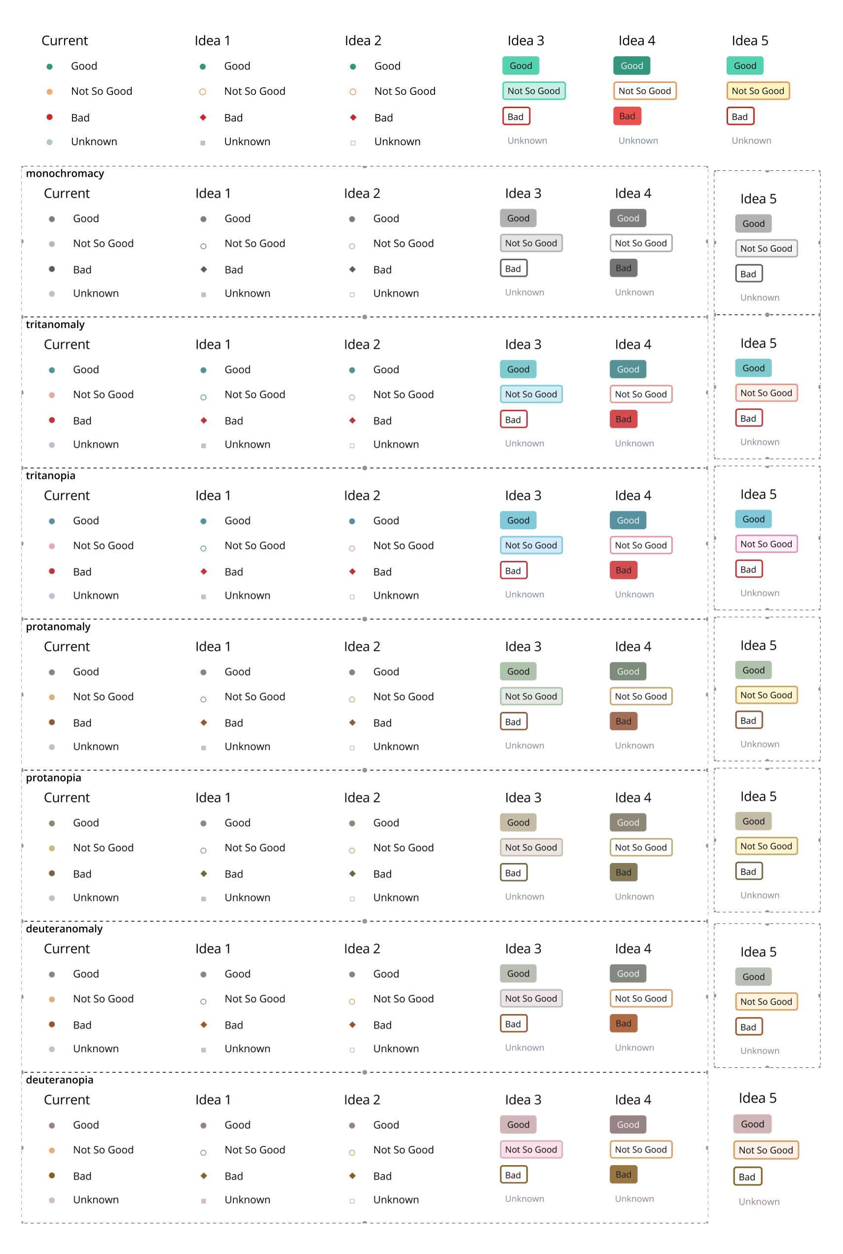
Accessibility testing while working through status indicators
Color Palette Testing
Building the color palette wasn’t done overnight. As I iterated on the palette, I tested it on a few key page types to make sure it would remain adhered to the brand. Here is a sample of some of the darkmode shades applied to some key pagetypes.
Sample testing for dark mode
Light and darkmode pagetypes were tested across our users work stations. The goal was to create a style that was differentiated from the native applications but didn’t feel so vastly distinct that it felt out of place.
After testing many different scales and tone richness we agreed across Marketing, Design and Engineering on the following palette.
Docker Color Palette

This is the full palette for both light and dark modes. As the overlaid type changes from light to dark, it informs the consumers of the palette to use that color to adhere to AA accessibility compliance. Taking this palette, and using the Brad Frost model, I created the component library.
Docker Design System v1.0
Docker Design System v1.0
Implementation with the design tools

I first created a library of symbols in Sketch, then we move to Figma and I ported the symbols over to create Figma components. Most of the components needed to be redrawn and restructured - tedious but work it.
In Practice
The design system allows the team to use the same components to help reduce drift. Here is an example of a Docker Enterprise product using the design system.
Docker design system and docker.com
Docker.com is a very heavily trafficked site, with over 4 million monthly active views. We wanted to apply the Docker Design System to Docker.com so we started by looking all all the pages and unifying the components.

Final Deliverables
Results
People were very excited about the inclusion of Dark Mode on docs.docker.com - with its 4 million monthly users we got a lot of impressions. Here are a few.


Whats Next?
The Docker Design System is an ever evolving tool with new components to introduce as needed. The system could never be limiting or blocked but allow for consistency and simplify the implementation process.